---
title: "Importance Sampling for Rare Events"
subtitle: "PyApprox Tutorial Library"
description: "When Monte Carlo needs millions of samples to see a single failure, importance sampling deliberately targets the tail and corrects with likelihood ratios."
tutorial_type: concept
topic: uncertainty_quantification
difficulty: intermediate
estimated_time: 12
render_time: 30
prerequisites:
- monte_carlo_sampling
- estimator_accuracy_mse
tags:
- uq
- monte-carlo
- importance-sampling
- rare-events
- failure-probability
- variance-reduction
format:
html:
code-fold: false
code-tools: true
toc: true
execute:
echo: true
warning: false
jupyter: python3
---
::: {.callout-tip collapse="true"}
## Download Notebook
[Download as Jupyter Notebook](notebooks/importance_sampling_concept.ipynb)
:::
## Learning Objectives
After completing this tutorial, you will be able to:
- Explain why Monte Carlo is **inefficient for small failure probabilities** and quantify the cost
- Formulate a failure probability as an integral and identify the variance bottleneck
- Derive the **importance sampling estimator** and explain the likelihood ratio correction
- Demonstrate empirically that importance sampling reduces variance by **orders of magnitude** for rare events
- Recognize the risk of **weight degeneracy** from a poor biasing distribution
## Prerequisites
Complete [Monte Carlo Sampling](monte_carlo_sampling.qmd) and [Estimator Accuracy and MSE](estimator_accuracy_mse.qmd) before this tutorial.
## Why Rare Events Break Monte Carlo
Estimating the probability of a rare but critical event --- a bridge deflecting past its safety limit, a circuit failing under thermal stress --- is one of the hardest problems in uncertainty quantification. The difficulty is simple to state: if failures happen one time in ten thousand, then a Monte Carlo experiment with a few hundred samples will almost certainly see **zero failures**. The estimate $\hat{p} = 0$ is technically unbiased (averaged over infinitely many experiments), but any single experiment is useless.
The [QMC tutorial](quasi_monte_carlo_sampling.qmd) showed that structured point sets accelerate convergence for smooth integrands. But failure probabilities involve the indicator function $\mathbb{1}[f > c]$, which is discontinuous --- exactly the case where QMC's advantage disappears.
We need a fundamentally different idea. Before deriving anything, let's see the problem.
## Seeing the Problem: Where Do the Samples Land?
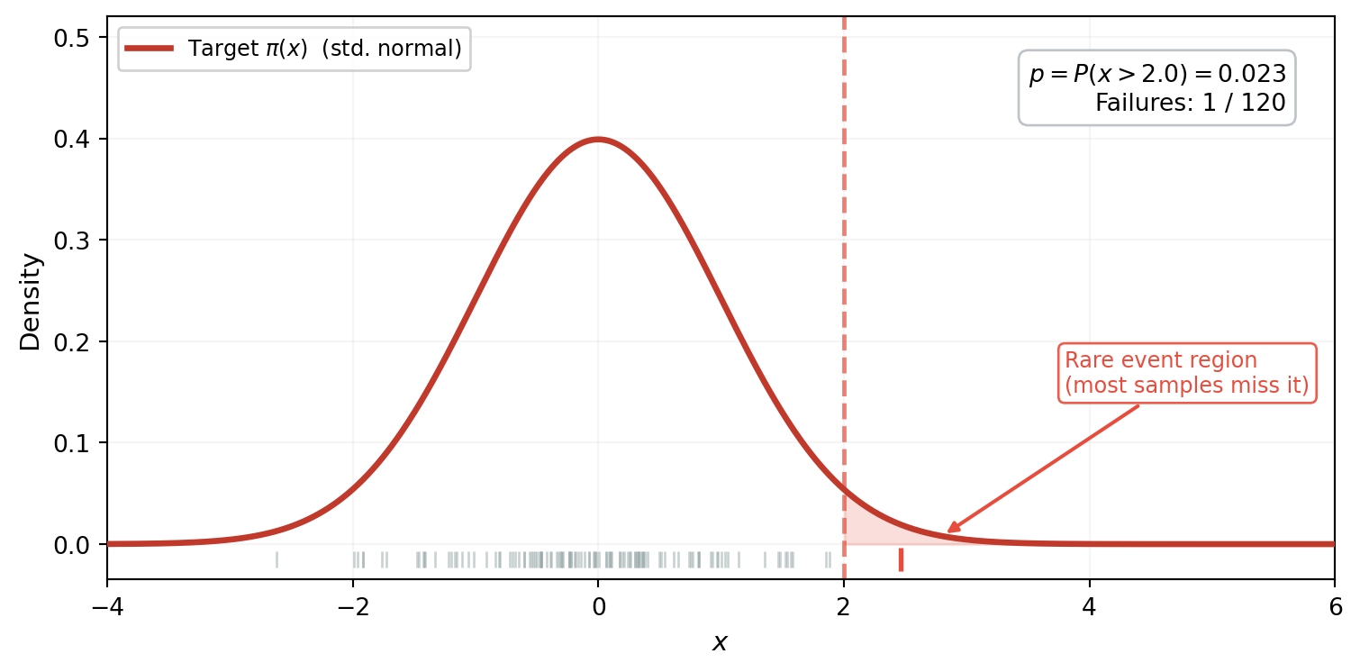
Consider estimating $p = P(x > 2)$ where $x \sim \mathcal{N}(0,1)$. The true probability is about 2.3%. @fig-mc-samples-1d shows 120 samples drawn from the standard normal, with the failure region $x > 2$ shaded.
```{python}
#| echo: false
import numpy as np
import matplotlib.pyplot as plt
from scipy import stats
from scipy.stats import norm as sp_norm
threshold_1d = 2.0
true_p_1d = sp_norm.sf(threshold_1d)
np.random.seed(42)
n_vis = 120
mc_vis = np.random.normal(0, 1, n_vis)
mc_fail_vis = mc_vis > threshold_1d
x_plot = np.linspace(-4, 6, 1000)
p_pdf = sp_norm.pdf(x_plot, 0, 1)
```
```{python}
#| echo: false
#| fig-cap: "120 samples from the standard normal $\\pi$. The failure region $x > 2$ (shaded red) sits in the far tail where $\\pi$ has almost no mass. Only 1 sample (red tick mark) lands past the threshold --- the other 119 contribute nothing to the failure probability estimate."
#| label: fig-mc-samples-1d
fig, ax = plt.subplots(figsize=(8, 4))
ax.fill_between(x_plot, p_pdf, where=(x_plot >= threshold_1d), alpha=0.18,
color="#e74c3c", zorder=1)
ax.plot(x_plot, p_pdf, color="#c0392b", lw=2.5, zorder=3,
label=r"Target $\pi(x)$ (std. normal)")
ax.axvline(threshold_1d, color="#e74c3c", lw=1.8, ls="--", alpha=0.7, zorder=2)
y_tick = -0.015
ax.scatter(mc_vis[~mc_fail_vis], np.full((~mc_fail_vis).sum(), y_tick),
marker="|", s=50, color="#95a5a6", alpha=0.5, linewidths=1, zorder=4)
ax.scatter(mc_vis[mc_fail_vis], np.full(mc_fail_vis.sum(), y_tick),
marker="|", s=90, color="#e74c3c", linewidths=2, zorder=5)
n_hits = mc_fail_vis.sum()
ax.text(0.96, 0.92,
f"$p = P(x > {threshold_1d}) = {true_p_1d:.3f}$\n"
f"Failures: {n_hits} / {n_vis}",
transform=ax.transAxes, ha="right", va="top", fontsize=10,
bbox=dict(boxstyle="round,pad=0.4", fc="white", ec="#bdc3c7"))
ax.annotate(
"Rare event region\n(most samples miss it)",
xy=(2.8, 0.008), xytext=(3.8, 0.15),
fontsize=9, color="#e74c3c",
arrowprops=dict(arrowstyle="-|>", color="#e74c3c", lw=1.5),
bbox=dict(boxstyle="round,pad=0.3", fc="white", ec="#e74c3c", alpha=0.9),
)
ax.set_xlabel("$x$", fontsize=11)
ax.set_ylabel("Density", fontsize=11)
ax.set_xlim(-4, 6)
ax.set_ylim(-0.035, 0.52)
ax.legend(fontsize=9, loc="upper left", framealpha=0.9)
ax.grid(True, alpha=0.12)
plt.tight_layout()
plt.show()
```
The picture tells the whole story: the target density $\pi$ concentrates almost all its mass between $-2$ and $2$. The failure region $x > 2$ sits in the far tail where $\pi$ is negligible --- samples simply don't land there. Of 120 draws, only 1 exceeds the threshold. The other 119 contribute nothing: each returns $\mathbb{1}[x_i > 2] = 0$.
## MC Estimation: The Consequence
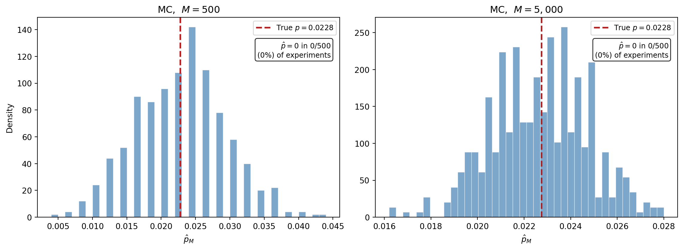
We just saw that a single MC experiment with 120 samples produced only 1 failure. What happens if we repeat this experiment hundreds of times? @fig-mc-failure-histogram runs 500 independent experiments at two sample sizes.
```{python}
#| echo: false
n_reps = 500
def mc_failure_estimates_1d(threshold, M, n_reps):
"""Run n_reps MC experiments for P(x > threshold), x ~ N(0,1)."""
estimates = np.empty(n_reps)
for i in range(n_reps):
np.random.seed(i)
samples = np.random.normal(0, 1, M)
estimates[i] = np.mean(samples > threshold)
return estimates
estimates_500_1d = mc_failure_estimates_1d(threshold_1d, 500, n_reps)
estimates_5000_1d = mc_failure_estimates_1d(threshold_1d, 5000, n_reps)
```
```{python}
#| echo: false
#| fig-cap: "MC estimates of $P(x > 2)$ from 500 independent experiments. Left: $M = 500$ --- many experiments see zero failures, producing $\\hat{p} = 0$ (the tall spike at the origin). Right: $M = 5{,}000$ --- fewer zeros, but estimates still scatter widely around the true value (red dashed line)."
#| label: fig-mc-failure-histogram
fig, (ax1, ax2) = plt.subplots(1, 2, figsize=(12, 4.5), sharey=False)
for ax, ests, M_lab in [(ax1, estimates_500_1d, 500), (ax2, estimates_5000_1d, 5000)]:
ax.hist(ests, bins=40, density=True, alpha=0.7, color="steelblue",
edgecolor="white", linewidth=0.5)
ax.axvline(true_p_1d, color="firebrick", linestyle="--", linewidth=2,
label=f"True $p = {true_p_1d:.4f}$")
n_zeros = np.sum(ests == 0)
ax.set_title(f"MC, $M = {M_lab:,}$", fontsize=12)
ax.set_xlabel(r"$\hat{p}_M$")
ax.legend(fontsize=9)
ax.text(0.97, 0.80,
f"$\\hat{{p}} = 0$ in {n_zeros}/{n_reps}\n"
f"({100 * n_zeros / n_reps:.0f}%) of experiments",
transform=ax.transAxes, ha="right", fontsize=9,
bbox=dict(boxstyle="round,pad=0.3", fc="white", alpha=0.85))
ax1.set_ylabel("Density")
plt.tight_layout()
plt.show()
```
The spike at zero in the left panel is exactly what @fig-mc-samples-1d predicted: experiments that drew hundreds of samples without a single one reaching the tail. The estimator is unbiased --- averaged over all 500 experiments the mean is close to the true $p$ --- but any individual estimate is nearly useless.
We can now quantify the pain. The MC estimator $\hat{p}_M = \frac{1}{M}\sum \mathbb{1}[x_i > c]$ is a sample mean of Bernoulli($p$) random variables. Its variance is $p(1-p)/M \approx p/M$ when $p$ is small, so the relative standard error is:
$$
\frac{\text{SE}[\hat{p}_M]}{p} = \frac{1}{\sqrt{Mp}}
$$
To achieve 10% relative error we need $M \approx 100/p$. For $p = 10^{-3}$ that is $100{,}000$ samples; for $p = 10^{-6}$ it is $100$ million. This is the formula behind the spike at zero: with $M = 500$ and $p \approx 0.023$, we need roughly $M \approx 4{,}000$ samples for 10% accuracy, so most 500-sample experiments miss the tail entirely.
What if we could sample from a *different* distribution --- one that puts its mass right where failures occur?
## The Key Idea: Sample Where Failures Happen
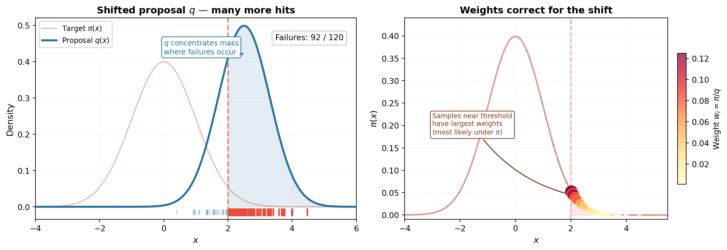
The fix is to **sample from a different distribution $q$ that places mass where failures occur**, then correct for the fact that we sampled from the wrong distribution. @fig-is-fix shows both steps.
```{python}
#| echo: false
#| fig-cap: "The importance sampling fix, continuing the 1D example from @fig-mc-samples-1d. **(Left)** A shifted proposal $q$ (blue, centered at 2.5) places most of its mass past the threshold. Of 120 samples, the majority now land in the failure region --- compare to the single hit in @fig-mc-samples-1d. **(Right)** But we can't just count them: they were drawn from $q$, not $\\pi$. Each sample is placed on the target density $\\pi$ and sized by its importance weight $w_i = \\pi(x_i) / q(x_i)$. Samples near the threshold carry the largest weights (dark red, large markers) because they are relatively most probable under $\\pi$. Samples deep in the tail, where $\\pi$ is negligible, are downweighted (yellow, small markers)."
#| label: fig-is-fix
np.random.seed(42)
n_vis = 120
q_mean = 2.5
q_std = 0.8
q_pdf = sp_norm.pdf(x_plot, q_mean, q_std)
is_vis = np.random.normal(q_mean, q_std, n_vis)
is_fail_vis = is_vis > threshold_1d
weights_vis = sp_norm.pdf(is_vis, 0, 1) / sp_norm.pdf(is_vis, q_mean, q_std)
fig, (ax_b, ax_c) = plt.subplots(1, 2, figsize=(13, 4.5))
# --- Left panel: proposal q with samples ---
ax_b.fill_between(x_plot, q_pdf, where=(x_plot >= threshold_1d), alpha=0.12,
color="#2471a3", zorder=1)
ax_b.plot(x_plot, p_pdf, color="#c0392b", lw=1.5, alpha=0.35, zorder=2,
label=r"Target $\pi(x)$")
ax_b.plot(x_plot, q_pdf, color="#2471a3", lw=2.5, zorder=3,
label=r"Proposal $q(x)$")
ax_b.axvline(threshold_1d, color="#e74c3c", lw=1.8, ls="--", alpha=0.7, zorder=2)
y_tick = -0.015
ax_b.scatter(is_vis[~is_fail_vis], np.full((~is_fail_vis).sum(), y_tick),
marker="|", s=50, color="#2471a3", alpha=0.4, linewidths=1, zorder=4)
ax_b.scatter(is_vis[is_fail_vis], np.full(is_fail_vis.sum(), y_tick),
marker="|", s=90, color="#e74c3c", linewidths=2, zorder=5)
n_is_hits = is_fail_vis.sum()
ax_b.text(0.96, 0.92,
f"Failures: {n_is_hits} / {n_vis}",
transform=ax_b.transAxes, ha="right", va="top", fontsize=10,
bbox=dict(boxstyle="round,pad=0.4", fc="white", ec="#bdc3c7"))
ax_b.annotate(
"$q$ concentrates mass\nwhere failures occur",
xy=(2.5, 0.42), xytext=(0.0, 0.42),
fontsize=9, color="#2471a3",
arrowprops=dict(arrowstyle="-|>", color="#2471a3", lw=1.5),
bbox=dict(boxstyle="round,pad=0.3", fc="white", ec="#2471a3", alpha=0.9),
)
ax_b.set_title("Shifted proposal $q$ — many more hits",
fontsize=12, fontweight="bold")
ax_b.set_xlabel("$x$", fontsize=11)
ax_b.set_ylabel("Density", fontsize=11)
ax_b.set_xlim(-4, 6)
ax_b.set_ylim(-0.035, 0.52)
ax_b.legend(fontsize=9, loc="upper left", framealpha=0.9)
ax_b.grid(True, alpha=0.12)
# --- Right panel: weighted samples on pi ---
ax_c.fill_between(x_plot, p_pdf, where=(x_plot >= threshold_1d), alpha=0.12,
color="#e74c3c", zorder=1)
ax_c.plot(x_plot, p_pdf, color="#c0392b", lw=2, alpha=0.5, zorder=2)
ax_c.axvline(threshold_1d, color="#e74c3c", lw=1.5, ls="--", alpha=0.5, zorder=2)
# Safe IS samples: small gray
ax_c.scatter(is_vis[~is_fail_vis],
sp_norm.pdf(is_vis[~is_fail_vis], 0, 1),
s=12, alpha=0.25, color="#95a5a6", edgecolors="none", zorder=4)
# Failure IS samples: sized by weight
w_fail = weights_vis[is_fail_vis]
w_sizes = 20 + 250 * (w_fail / w_fail.max())
sc = ax_c.scatter(is_vis[is_fail_vis],
sp_norm.pdf(is_vis[is_fail_vis], 0, 1),
s=w_sizes, alpha=0.7, c=w_fail, cmap="YlOrRd",
edgecolors="white", linewidth=0.5, zorder=5)
cbar = fig.colorbar(sc, ax=ax_c, shrink=0.65, pad=0.03, aspect=15)
cbar.set_label(r"Weight $w_i = \pi / q$", fontsize=10)
ax_c.annotate(
"Samples near threshold\nhave largest weights\n(most likely under $\\pi$)",
xy=(2.1, sp_norm.pdf(2.1, 0, 1)), xytext=(-3.0, 0.18),
fontsize=8.5, color="#7d3c1f",
arrowprops=dict(arrowstyle="-|>", color="#7d3c1f", lw=1.3,
connectionstyle="arc3,rad=0.2"),
bbox=dict(boxstyle="round,pad=0.3", fc="white", ec="#7d3c1f", alpha=0.9),
)
ax_c.set_title("Weights correct for the shift",
fontsize=12, fontweight="bold")
ax_c.set_xlabel("$x$", fontsize=11)
ax_c.set_ylabel(r"$\pi(x)$", fontsize=11)
ax_c.set_xlim(-4, 5.5)
ax_c.set_ylim(-0.01, 0.44)
ax_c.grid(True, alpha=0.12)
plt.tight_layout()
plt.show()
```
The left panel is the "aha": by shifting the sampling distribution to $q$, the majority of samples now exceed the threshold. But these samples were drawn from $q$, not $\pi$ --- we can't simply count them. The right panel shows the correction: each sample is placed on the target density $\pi$ and scaled by its importance weight $w_i = \pi(x_i)/q(x_i)$. Samples near the threshold are the most valuable --- they are relatively probable under $\pi$ and carry the largest weights. Samples deep in the tail, where $q \gg \pi$, contribute almost nothing after reweighting.
This is the entire importance sampling mechanism: **sample where it matters, then correct for the bias**.
## Formalizing the Idea
### The importance sampling estimator
The figure above showed the mechanism; now we write it down. The failure probability is an integral:
$$
p = P\bigl(f(\boldsymbol{\theta}) > c\bigr) = \int \mathbb{1}\bigl[f(\boldsymbol{\theta}) > c\bigr]\, \pi(\boldsymbol{\theta})\, d\boldsymbol{\theta}
$$
Multiply and divide by the proposal density $q$:
$$
p = \int \mathbb{1}[f(\boldsymbol{\theta}) > c]\, \frac{\pi(\boldsymbol{\theta})}{q(\boldsymbol{\theta})}\, q(\boldsymbol{\theta})\, d\boldsymbol{\theta}
$$
Now sample from $q$ instead of $\pi$:
$$
\hat{p}_M^{\text{IS}} = \frac{1}{M} \sum_{i=1}^{M} \mathbb{1}[f(\boldsymbol{\theta}^{(i)}) > c]\, \frac{\pi(\boldsymbol{\theta}^{(i)})}{q(\boldsymbol{\theta}^{(i)})}, \qquad \boldsymbol{\theta}^{(i)} \sim q
$$
The ratio $w(\boldsymbol{\theta}) = \pi(\boldsymbol{\theta}) / q(\boldsymbol{\theta})$ is the **likelihood ratio** or **importance weight**. Each term maps directly to something in @fig-is-fix:
- $\boldsymbol{\theta}^{(i)} \sim q$ --- left panel: samples drawn from the shifted proposal
- $\mathbb{1}[f(\boldsymbol{\theta}^{(i)}) > c]$ --- the red tick marks: which samples exceed the threshold
- $w_i = \pi / q$ --- right panel: the marker sizes that correct for the distributional shift
The estimator is **unbiased** for any valid $q$ (any distribution positive wherever $\pi \cdot \mathbb{1}[f > c] > 0$). The choice of $q$ affects only the **variance** --- and a good choice can reduce it by orders of magnitude.
## Setup: The Beam Model with a Failure Threshold
We now apply importance sampling to a realistic engineering model. We use the analytical cantilever beam with $\mathrm{Beta}(2, 5)$ priors on the two Young's moduli, the same model as the [QMC tutorial](quasi_monte_carlo_sampling.qmd).
```{python}
from pyapprox.util.backends.numpy import NumpyBkd
from pyapprox_benchmarks.pde.cantilever_beam_1d_analytical import (
    build_cantilever_beam_1d_analytical,
)

bkd = NumpyBkd()

problem = build_cantilever_beam_1d_analytical(bkd)
model = problem.function()
variable = problem.prior()

print(f"Number of uncertain parameters: {model.nvars()}")
print(f"Number of QoIs: {model.nqoi()}")
```
We define "failure" as tip deflection exceeding a threshold $c$. We choose $c$ so that the true failure probability is small but still computable by quadrature --- around $p \approx 0.01$ to $0.001$, depending on the model's output range.
```{python}
#| echo: false
from pyapprox.surrogates.quadrature import (
TensorProductQuadratureRule,
gauss_quadrature_rule,
)
nquad = 40
marginals = variable.marginals()
quad_rules = [lambda n, m=m: gauss_quadrature_rule(m, n, bkd) for m in marginals]
quad_rule = TensorProductQuadratureRule(bkd, quad_rules, [nquad] * len(marginals))
quad_pts, quad_wts = quad_rule()
qoi_quad = model(quad_pts)[0] # tip deflection
```
```{python}
# Choose a threshold in the upper tail of the deflection distribution
# using quadrature-weighted CDF evaluation.
# Search for a threshold that gives true p ≈ 0.005
# by evaluating P(QoI > c) via quadrature at many candidate thresholds.
qoi_np = bkd.to_numpy(qoi_quad)
wts_np = bkd.to_numpy(quad_wts)
candidates = np.linspace(np.percentile(qoi_np, 95), np.max(qoi_np), 200)
probs = np.array([
    float(np.dot(wts_np, (qoi_np > c).astype(float))) for c in candidates
])

# Pick the threshold closest to the target failure probability
target_p = 0.005
threshold = float(candidates[np.argmin(np.abs(probs - target_p))])

# True failure probability via quadrature
indicator = bkd.asarray((qoi_np > threshold).astype(float))
true_p = bkd.to_float(bkd.sum(quad_wts * indicator))

print(f"Failure threshold c:         {threshold:.6f}")
print(f"True failure probability p:  {true_p:.6f}")
print(f"Samples needed for 10% relative SE (MC): {int(100 / true_p):,}")
```
## Visualizing the Failure Region
@fig-failure-region shows the beam model's response surface in $(E_1, E_2)$ input space. The failure region --- where the tip deflection exceeds the threshold --- is a thin sliver in the corner of the input domain. Most samples drawn from the prior land far from this region and contribute nothing to the failure probability estimate.
```{python}
#| echo: false
#| fig-cap: "The beam's input space with tip deflection shown as a contour map. The failure region $\\delta_{\\text{tip}} > c$ (red shading) occupies a small fraction of the prior's support. Of $M = 2{,}000$ prior samples, only a handful (red diamonds) land in the failure region --- the rest (blue dots) contribute zero to the failure probability estimate."
#| label: fig-failure-region
# Evaluate model on a grid for the contour plot
n_grid = 100
marginal_list = variable.marginals()
# Extract bounds directly from the marginals
x1_lo, x1_hi = marginal_list[0].bounds()
x2_lo, x2_hi = marginal_list[1].bounds()
x1_grid = np.linspace(x1_lo, x1_hi, n_grid)
x2_grid = np.linspace(x2_lo, x2_hi, n_grid)
X1, X2 = np.meshgrid(x1_grid, x2_grid)
grid_pts = bkd.asarray(np.vstack([X1.ravel(), X2.ravel()]))
grid_qoi = bkd.to_numpy(model(grid_pts)[0]).reshape(n_grid, n_grid)
# Draw prior samples and classify
np.random.seed(42)
M_vis = 2000
samples_vis = variable.rvs(M_vis)
qoi_vis = bkd.to_numpy(model(samples_vis)[0])
fail_mask = qoi_vis > threshold
fig, ax = plt.subplots(figsize=(8, 6))
# Contour of tip deflection
cf = ax.contourf(X1, X2, grid_qoi, levels=30, cmap="YlOrRd", alpha=0.6)
ax.contour(X1, X2, grid_qoi, levels=[threshold], colors="firebrick",
linewidths=2.5, linestyles="--")
# Shade failure region
ax.contourf(X1, X2, grid_qoi, levels=[threshold, grid_qoi.max()],
colors=["firebrick"], alpha=0.15)
# Prior samples
samples_vis_np = bkd.to_numpy(samples_vis)
ax.scatter(samples_vis_np[0, ~fail_mask], samples_vis_np[1, ~fail_mask],
s=6, alpha=0.3, color="steelblue", edgecolors="none",
label=f"Safe ({int((~fail_mask).sum())})")
ax.scatter(samples_vis_np[0, fail_mask], samples_vis_np[1, fail_mask],
s=30, alpha=0.9, color="firebrick", edgecolors="white",
linewidth=0.5, marker="D",
label=f"Failure ({int(fail_mask.sum())})")
ax.set_xlabel(r"$E_1$", fontsize=12)
ax.set_ylabel(r"$E_2$", fontsize=12)
ax.set_title(r"Failure region: $\delta_{\mathrm{tip}} > c$", fontsize=13)
ax.legend(fontsize=10, loc="upper right")
cbar = fig.colorbar(cf, ax=ax, label=r"$\delta_{\mathrm{tip}}$")
plt.tight_layout()
plt.show()
```
## Choosing a Biasing Distribution
For the beam model with bounded Beta priors on $(E_1, E_2)$, a practical strategy is to **shift** the sampling distribution toward the failure region. If we know approximately where failures occur --- for example, from the response surface in @fig-failure-region --- we can center $q$ near the failure boundary.
A simple approach: use a truncated normal (or Beta with adjusted parameters) centered near the region of input space where $f$ is close to the threshold. For this tutorial, we approximate the failure region's center from the response surface and define $q$ as a product of independent shifted Beta distributions.
```{python}
# Identify the approximate center of the failure region
# using the prior samples that exceeded the threshold
fail_samples = samples_vis_np[:, fail_mask]
if fail_samples.shape[1] > 0:
    shift_center = np.mean(fail_samples, axis=1)
else:
    # Fallback: use the point with the highest QoI value
    shift_center = samples_vis_np[:, np.argmax(qoi_vis)]

print(f"Approximate failure region center: {shift_center}")
```
```{python}
# Build the biasing distribution q as a product of independent
# truncated normals centered near the failure region, truncated
# to the prior's support bounds.

# Extract prior support bounds from the marginals
marginal_list = variable.marginals()
prior_bounds = [m.bounds() for m in marginal_list]

# Define biasing distribution: truncated normal per dimension
# Spread chosen to cover the failure region without being too narrow
is_spread_factor = 0.15  # fraction of support width

def log_q_pdf(theta, shift_center, bounds, spread_factor):
    """Log-pdf of the biasing distribution (product of truncated normals)."""
    log_pdf = 0.0
    for d in range(len(shift_center)):
        lo, hi = bounds[d]
        sigma = spread_factor * (hi - lo)
        a, b = (lo - shift_center[d]) / sigma, (hi - shift_center[d]) / sigma
        log_pdf += stats.truncnorm.logpdf(
            theta[d], a, b, loc=shift_center[d], scale=sigma
        )
    return log_pdf

def sample_q(M, shift_center, bounds, spread_factor, rng):
    """Draw M samples from the biasing distribution."""
    nvars = len(shift_center)
    samples = np.empty((nvars, M))
    for d in range(nvars):
        lo, hi = bounds[d]
        sigma = spread_factor * (hi - lo)
        a, b = (lo - shift_center[d]) / sigma, (hi - shift_center[d]) / sigma
        samples[d] = stats.truncnorm.rvs(
            a, b, loc=shift_center[d], scale=sigma, size=M,
            random_state=rng,
        )
    return samples

def log_prior_pdf(theta, variable, bkd):
    """Log-pdf of the prior (IndependentJoint) evaluated at theta."""
    # variable.logpdf expects shape (nvars, nsamples) and returns (1, nsamples)
    log_pdf_arr = variable.logpdf(bkd.asarray(theta))
    return bkd.to_numpy(log_pdf_arr).ravel()
```
## Visualizing the Biasing Distribution
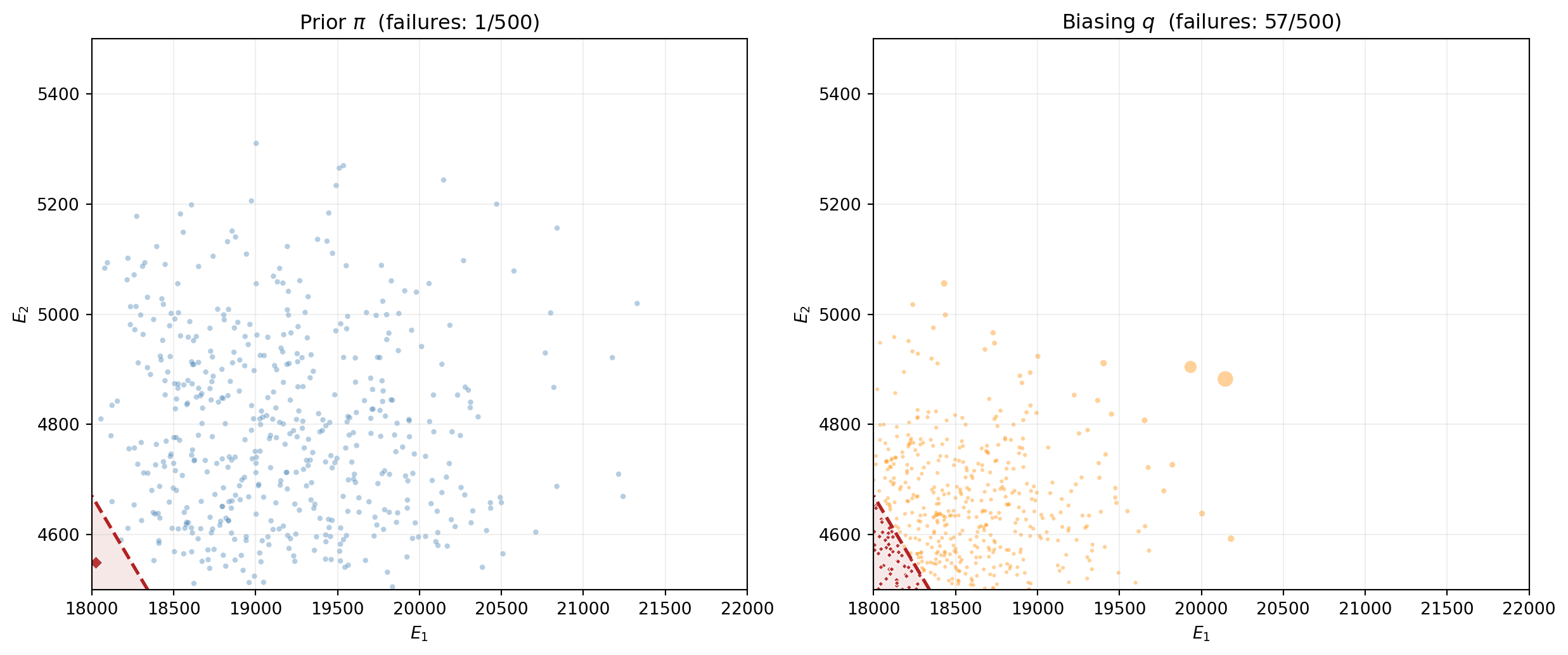
@fig-is-biasing-visual compares prior sampling (left) with importance sampling (right). The IS samples cluster in the failure region; the marker sizes show the importance weights that correct for the distributional shift.
```{python}
#| echo: false
#| fig-cap: "Left: $M = 500$ samples from the prior $\\pi$ --- few reach the failure region. Right: $M = 500$ samples from the biasing distribution $q$ (truncated normal centered near the failure boundary). Many more samples land in the failure region. Marker size is proportional to the importance weight $w_i = \\pi(\\boldsymbol{\\theta}^{(i)}) / q(\\boldsymbol{\\theta}^{(i)})$; samples far from the prior center receive smaller weights."
#| label: fig-is-biasing-visual
M_is_vis = 500
# Prior samples
np.random.seed(99)
s_prior = bkd.to_numpy(variable.rvs(M_is_vis))
q_prior = bkd.to_numpy(model(bkd.asarray(s_prior))[0])
fail_prior = q_prior > threshold
# IS samples
rng_is = np.random.RandomState(99)
s_is = sample_q(M_is_vis, shift_center, prior_bounds, is_spread_factor, rng_is)
q_is_vals = bkd.to_numpy(model(bkd.asarray(s_is))[0])
fail_is = q_is_vals > threshold
# Compute importance weights
log_w = log_prior_pdf(s_is, variable, bkd) - log_q_pdf(
s_is, shift_center, prior_bounds, is_spread_factor
)
w = np.exp(log_w - np.max(log_w)) # stabilize for visualization
w_sizes = 5 + 80 * (w / w.max()) # map to marker sizes
fig, (ax1, ax2) = plt.subplots(1, 2, figsize=(13, 5.5))
# Left: prior samples
ax1.contourf(X1, X2, grid_qoi, levels=[threshold, grid_qoi.max()],
colors=["firebrick"], alpha=0.1)
ax1.contour(X1, X2, grid_qoi, levels=[threshold], colors="firebrick",
linewidths=2, linestyles="--")
ax1.scatter(s_prior[0, ~fail_prior], s_prior[1, ~fail_prior],
s=10, alpha=0.4, color="steelblue", edgecolors="none")
ax1.scatter(s_prior[0, fail_prior], s_prior[1, fail_prior],
s=30, alpha=0.9, color="firebrick", marker="D",
edgecolors="white", linewidth=0.5)
ax1.set_title(f"Prior $\\pi$ (failures: {int(fail_prior.sum())}/{M_is_vis})",
fontsize=12)
ax1.set_xlabel(r"$E_1$")
ax1.set_ylabel(r"$E_2$")
ax1.grid(True, alpha=0.2)
# Right: IS samples with weight-scaled markers
ax2.contourf(X1, X2, grid_qoi, levels=[threshold, grid_qoi.max()],
colors=["firebrick"], alpha=0.1)
ax2.contour(X1, X2, grid_qoi, levels=[threshold], colors="firebrick",
linewidths=2, linestyles="--")
ax2.scatter(s_is[0, ~fail_is], s_is[1, ~fail_is],
s=w_sizes[~fail_is], alpha=0.4, color="darkorange",
edgecolors="none")
ax2.scatter(s_is[0, fail_is], s_is[1, fail_is],
s=w_sizes[fail_is], alpha=0.9, color="firebrick",
marker="D", edgecolors="white", linewidth=0.5)
ax2.set_title(f"Biasing $q$ (failures: {int(fail_is.sum())}/{M_is_vis})",
fontsize=12)
ax2.set_xlabel(r"$E_1$")
ax2.set_ylabel(r"$E_2$")
ax2.grid(True, alpha=0.2)
plt.tight_layout()
plt.show()
```
## IS in Action: Variance Reduction
We now run the same 500-replicate experiment as before, but using importance sampling with $M = 500$ samples per replicate.
```{python}
#| echo: false
def mc_failure_estimates(variable, model, threshold, M, n_reps, bkd):
"""Run n_reps MC experiments, each with M samples."""
estimates = np.empty(n_reps)
for i in range(n_reps):
np.random.seed(i)
s = variable.rvs(M)
q = bkd.to_numpy(model(s)[0])
estimates[i] = np.mean(q > threshold)
return estimates
estimates_500 = mc_failure_estimates(variable, model, threshold, 500, n_reps, bkd)
estimates_5000 = mc_failure_estimates(variable, model, threshold, 5000, n_reps, bkd)
```
```{python}
def is_failure_estimates(model, variable, threshold, M, n_reps,
                         shift_center, bounds, spread_factor, bkd):
    """Run n_reps IS experiments, each with M samples."""
    estimates = np.empty(n_reps)
    for i in range(n_reps):
        rng = np.random.RandomState(i + 100000)
        s = sample_q(M, shift_center, bounds, spread_factor, rng)
        # Evaluate model using bkd arrays
        s_bkd = bkd.asarray(s)
        q_vals = bkd.to_numpy(model(s_bkd)[0])
        indicator = (q_vals > threshold).astype(float)

        # Importance weights: pi(theta) / q(theta)
        log_w = log_prior_pdf(s, variable, bkd) - log_q_pdf(
            s, shift_center, bounds, spread_factor
        )
        w = np.exp(log_w)
        estimates[i] = np.mean(indicator * w)
    return estimates

is_estimates_500 = is_failure_estimates(
    model, variable, threshold, 500, n_reps,
    shift_center, prior_bounds, is_spread_factor, bkd,
)
```
@fig-is-vs-mc-histogram places the MC and IS histograms side by side.
```{python}
#| echo: false
#| fig-cap: "Failure probability estimates from 500 experiments with $M = 500$ samples each. Left: standard MC --- wide spread with many zero estimates. Right: importance sampling with a shifted truncated normal --- dramatically narrower, no zeros, centered on the true probability."
#| label: fig-is-vs-mc-histogram
fig, (ax1, ax2) = plt.subplots(1, 2, figsize=(12, 4.5))
# Shared x-limits so the width difference is visually obvious
all_ests = np.concatenate([estimates_500, is_estimates_500])
xlim = (min(0, all_ests.min()) - 0.001, all_ests.max() + 0.001)
# MC panel (reuse estimates_500 from earlier)
ax1.hist(estimates_500, bins=40, density=True, alpha=0.7,
color="steelblue", edgecolor="white", linewidth=0.5)
ax1.axvline(true_p, color="firebrick", linestyle="--", linewidth=2,
label=f"True $p$")
n_zeros_mc = np.sum(estimates_500 == 0)
ax1.set_title(f"MC, $M = 500$", fontsize=12)
ax1.set_xlabel(r"$\hat{p}$")
ax1.set_ylabel("Density")
ax1.set_xlim(xlim)
ax1.legend(fontsize=9)
ax1.text(0.97, 0.80,
f"std = {np.std(estimates_500):.2e}\n"
f"zeros: {n_zeros_mc}/{n_reps}",
transform=ax1.transAxes, ha="right", fontsize=9,
bbox=dict(boxstyle="round,pad=0.3", fc="white", alpha=0.85))
# IS panel
ax2.hist(is_estimates_500, bins=40, density=True, alpha=0.7,
color="seagreen", edgecolor="white", linewidth=0.5)
ax2.axvline(true_p, color="firebrick", linestyle="--", linewidth=2,
label=f"True $p$")
ax2.set_title(f"Importance Sampling, $M = 500$", fontsize=12)
ax2.set_xlabel(r"$\hat{p}^{\mathrm{IS}}$")
ax2.set_xlim(xlim)
ax2.legend(fontsize=9)
ax2.text(0.97, 0.80,
f"std = {np.std(is_estimates_500):.2e}\n"
f"zeros: {np.sum(is_estimates_500 == 0)}/{n_reps}",
transform=ax2.transAxes, ha="right", fontsize=9,
bbox=dict(boxstyle="round,pad=0.3", fc="white", alpha=0.85))
plt.tight_layout()
plt.show()
```
The IS histogram is dramatically narrower and has no zeros. The variance reduction factor quantifies the improvement: IS with $M = 500$ is as precise as MC with many thousands of samples.
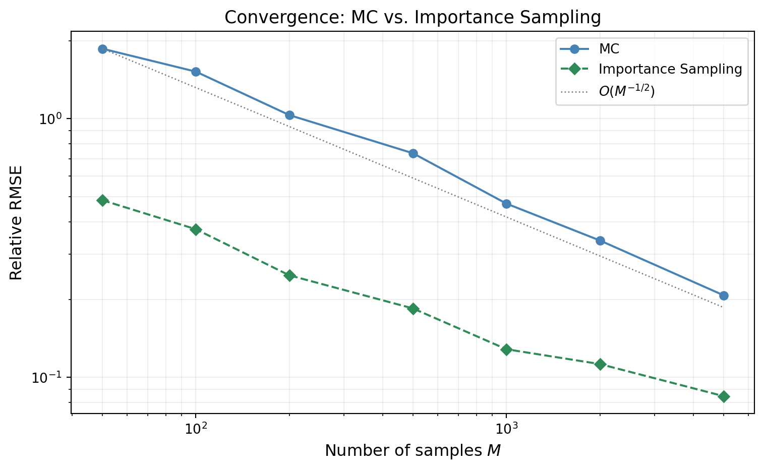
## Convergence Comparison
@fig-is-convergence shows the relative RMSE of both estimators as a function of $M$. Both converge at rate $O(M^{-1/2})$ --- importance sampling does not change the rate. It reduces the **constant**, which on a log-log plot appears as a vertical shift between two parallel lines.
```{python}
#| echo: false
#| fig-cap: "Relative RMSE of the failure probability estimate vs. sample size. Both MC (blue) and IS (green) converge at $O(M^{-1/2})$ (parallel lines on the log-log plot), but the IS constant is orders of magnitude smaller. IS with $M = 100$ can achieve the same accuracy as MC with $M \\approx 50{,}000$."
#| label: fig-is-convergence
M_conv_values = [50, 100, 200, 500, 1000, 2000, 5000]
n_reps_conv = 300
rrmse_mc = []
rrmse_is = []
for M in M_conv_values:
# MC
mc_ests = mc_failure_estimates(variable, model, threshold, M, n_reps_conv, bkd)
rrmse_mc.append(np.sqrt(np.mean((mc_ests - true_p)**2)) / true_p)
# IS
is_ests = is_failure_estimates(
model, variable, threshold, M, n_reps_conv,
shift_center, prior_bounds, is_spread_factor, bkd,
)
rrmse_is.append(np.sqrt(np.mean((is_ests - true_p)**2)) / true_p)
fig, ax = plt.subplots(figsize=(8, 5))
M_arr = np.array(M_conv_values, dtype=float)
ax.loglog(M_arr, rrmse_mc, "o-", color="steelblue", label="MC",
markersize=6, linewidth=1.5)
ax.loglog(M_arr, rrmse_is, "D--", color="seagreen", label="Importance Sampling",
markersize=6, linewidth=1.5)
# Reference slope
c_ref = rrmse_mc[0] * M_arr[0]**0.5
ax.loglog(M_arr, c_ref * M_arr**(-0.5), ":", color="gray", linewidth=1,
label=r"$O(M^{-1/2})$")
ax.set_xlabel("Number of samples $M$", fontsize=12)
ax.set_ylabel("Relative RMSE", fontsize=12)
ax.set_title("Convergence: MC vs. Importance Sampling", fontsize=13)
ax.legend(fontsize=10)
ax.grid(True, which="both", alpha=0.2)
plt.tight_layout()
plt.show()
```
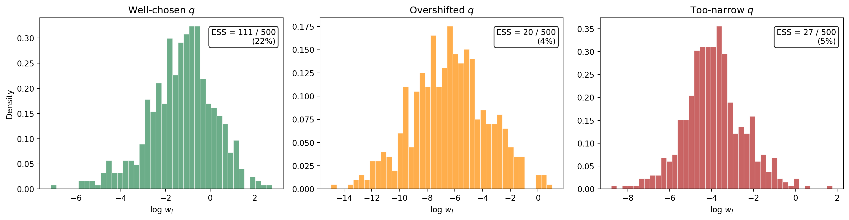
## The Danger of Bad IS: Weight Degeneracy
Importance sampling is not a free lunch. If $q$ is poorly chosen --- shifted too far into the tail, or made too narrow --- a small number of samples can acquire enormous importance weights while the rest contribute almost nothing. This is **weight degeneracy**: the effective sample size collapses even though $M$ is large.
The **effective sample size** diagnoses this:
$$
\text{ESS} = \frac{\bigl(\sum_{i=1}^{M} w_i\bigr)^2}{\sum_{i=1}^{M} w_i^2}
$$
When all weights are equal, $\text{ESS} = M$. When one weight dominates, $\text{ESS} \approx 1$. A ratio $\text{ESS}/M \ll 1$ signals that the IS estimate is unreliable.
@fig-weight-degeneracy compares the distribution of log-importance-weights for three choices of the biasing distribution: a well-chosen shift, an overshifted $q$, and an overly narrow $q$.
```{python}
#| echo: false
#| fig-cap: "Histograms of log importance weights $\\log w_i$ for three biasing distributions, each with $M = 500$. Left: well-chosen $q$ near the failure boundary --- weights are moderate, ESS is high. Center: $q$ shifted too far past the failure region --- a few extreme weights dominate, ESS collapses. Right: $q$ with too-small spread --- similar degeneracy. The effective sample size (ESS) is shown in each panel."
#| label: fig-weight-degeneracy
# Three q choices: good, overshifted, too narrow
shift_configs = [
("Well-chosen $q$", shift_center, is_spread_factor),
]
# Overshifted: push the center further into the tail
prior_mean = np.array([
0.5 * (lo + hi) for lo, hi in prior_bounds
])
overshifted_center = shift_center + 1.5 * (shift_center - prior_mean)
shift_configs.append(("Overshifted $q$", overshifted_center, is_spread_factor))
# Too narrow: same center but very small spread
shift_configs.append(("Too-narrow $q$", shift_center, is_spread_factor * 0.3))
M_deg = 500
fig, axes = plt.subplots(1, 3, figsize=(15, 4))
colors = ["seagreen", "darkorange", "firebrick"]
for ax, (label, center, spread), color in zip(axes, shift_configs, colors):
rng = np.random.RandomState(42)
s = sample_q(M_deg, center, prior_bounds, spread, rng)
q_vals = bkd.to_numpy(model(bkd.asarray(s))[0])
log_w = log_prior_pdf(s, variable, bkd) - log_q_pdf(
s, center, prior_bounds, spread
)
w = np.exp(log_w)
ess = (np.sum(w))**2 / np.sum(w**2)
ax.hist(log_w, bins=40, density=True, alpha=0.7,
color=color, edgecolor="white", linewidth=0.5)
ax.set_title(label, fontsize=12)
ax.set_xlabel(r"$\log\, w_i$")
if ax == axes[0]:
ax.set_ylabel("Density")
ax.text(0.97, 0.85,
f"ESS = {ess:.0f} / {M_deg}\n({100 * ess / M_deg:.0f}%)",
transform=ax.transAxes, ha="right", fontsize=10,
bbox=dict(boxstyle="round,pad=0.3", fc="white", alpha=0.85))
plt.tight_layout()
plt.show()
```
The well-chosen $q$ produces log-weights that are concentrated in a narrow range --- the effective sample size is a healthy fraction of $M$. The overshifted and too-narrow distributions produce log-weight histograms with heavy tails, indicating that a handful of extreme weights dominate the estimator.
## Finding the Failure Region in Practice
The IS estimator above assumed we already knew approximately where failures occur. For the 2D beam model, we could read this from the response surface plot. In realistic problems with expensive models and high-dimensional input spaces, this is not straightforward.
::: {.callout-note}
## Looking ahead: surrogates and optimization
A common practical workflow is to build a cheap **surrogate model** (e.g., a polynomial chaos expansion or Gaussian process emulator) from a modest pilot sample, and then use the surrogate to identify the failure region. Specifically:
1. **Optimization on the surrogate.** Solve $\min_{\boldsymbol{\theta}} -f_{\text{surr}}(\boldsymbol{\theta})$ subject to $\boldsymbol{\theta}$ being in the prior's support, or equivalently find the **most probable failure point** (MPP) by minimizing the distance from the prior mode subject to $f_{\text{surr}}(\boldsymbol{\theta}) \ge c$. This is a standard reliability analysis technique (FORM/SORM) and locates the region of input space where failures are most likely under the prior.
2. **Hessian-based proposal covariance.** The Hessian of $\log \pi(\boldsymbol{\theta})$ (or of the limit-state function $g = f - c$) at the MPP provides curvature information about the failure boundary. Its inverse gives a natural covariance matrix for the biasing distribution $q$ --- a multivariate normal centered at the MPP with covariance proportional to the inverse Hessian. This adapts the shape and orientation of $q$ to the local geometry of the failure surface, without requiring manual tuning.
3. **Iterative refinement.** Run IS with the surrogate-based $q$, use the resulting weighted samples to update the surrogate in the failure region, and re-optimize. This focuses surrogate accuracy where it matters most for the failure probability estimate.
These techniques make IS practical for expensive, high-dimensional models where visual inspection of the failure region is impossible. They are the subject of a later tutorial.
:::
## Exercises
1. Vary the threshold $c$ to produce true failure probabilities ranging from $10^{-2}$ to $10^{-4}$. How does the IS variance reduction factor (ratio of MC variance to IS variance at fixed $M$) change as $p$ decreases? Does IS become *more* or *less* valuable for rarer events?
2. For the beam model, use a pilot MC run of $M = 200$ to estimate the center of the failure region (mean of the failing samples). Use this as `shift_center` for IS. Compare the resulting variance reduction to using an arbitrary shift. How sensitive is the result to the accuracy of the center estimate?
3. Implement the effective sample size $\text{ESS} = (\sum w_i)^2 / \sum w_i^2$ and monitor it as you vary the `is_spread_factor` from 0.05 to 0.5. Plot $\text{ESS}/M$ vs. spread factor. Where does ESS collapse? What is the practical "sweet spot"?
4. **(Challenge)** Combine importance sampling with QMC: use a Sobol sequence in $[0,1]^2$ and transform it through $q$'s inverse CDF (instead of the prior's). Compare the variance of this QMC-IS estimator to both plain IS and plain MC. Does the QMC structure help even though the integrand contains a discontinuous indicator?
## Key Takeaways
- MC needs $M \approx 100/p$ samples for 10% relative error on a failure probability $p$ --- prohibitive for rare events
- QMC cannot help much: the indicator integrand is discontinuous, so the Koksma--Hlawka advantage disappears
- Importance sampling reweights samples from a biasing distribution $q$ that concentrates mass in the failure region, correcting via the likelihood ratio $\pi/q$
- IS does not change the convergence **rate** ($1/\sqrt{M}$) but can reduce the variance **constant** by orders of magnitude
- Poor choice of $q$ leads to **weight degeneracy** --- a few extreme weights dominate and the estimate becomes unreliable; the effective sample size ESS diagnoses this
- In practice, surrogates and optimization (FORM/SORM, Hessian-based proposals) provide systematic ways to construct good biasing distributions for expensive, high-dimensional models
## Next Steps
Continue with:
- [Control Variates](control_variate_concept.qmd) --- Using correlated auxiliary quantities to reduce estimator variance