This document is autogenerated from generate_ui_documentation.py. Do not edit this document directly.
Output Voltages The peak voltages that will be output by the environment based on the open-loop test prediction. Double-clicking an item will show the time history for that drive channel.
Output Plot Displays various quantities of interest related to the excitation signals.
Min Drive Visualize the signal with the smallest peak drive voltage
Max Drive Visualize the drive signal with the largest peak voltage
Output Display Channel Select the drive channel to visualize
Output Display Type Selects the type of data to plot.
Output Sine Tone Selects the sine tone to plot.
Maximum Amplitude Error Table A table showing the maximum amplitude error in decibels for each sine tone (rows) and control channel (columns). Cells highlighted yellow are predicted to hit warning limits while cells highlighted red are predicted to hit abort limits. Double-clicking on a cell will show the amplitude vs. frequency plot for that sine tone and control channel.
Response Prediction Plot Displays various quantities of interest related to the response predictions.
Min Error Visualize the signal with the smallest predicted amplitude error
Max Error Visualize the signal with the largest predicted amplitude error
Recompute Predictions Recompute predictions by running the control law again.
Response Prediction Display Channel Select the control channel to visualize
Response Prediction Display Type Selects the type of data to plot.
Response Prediction Sine Tone Selects the sine tone to plot.
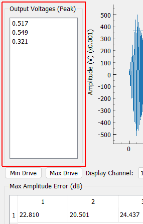
Output Voltages (Peak)
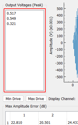
Output Voltages The peak voltages that will be output by the environment based on the open-loop test prediction. Double-clicking an item will show the time history for that drive channel.
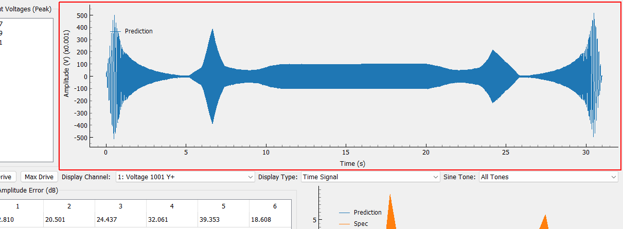
Output Plot Displays various quantities of interest related to the excitation signals.
Min Drive Visualize the signal with the smallest peak drive voltage
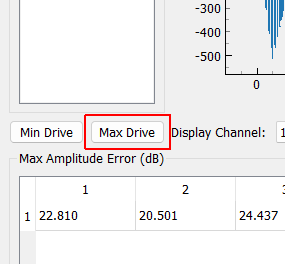
Max Drive Visualize the drive signal with the largest peak voltage
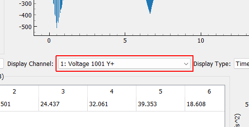
Output Display Channel Select the drive channel to visualize
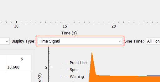
Output Display Type Selects the type of data to plot.
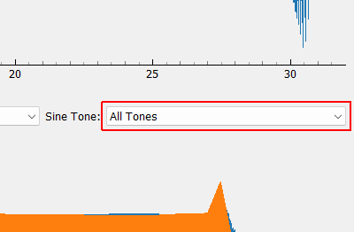
Output Sine Tone Selects the sine tone to plot.
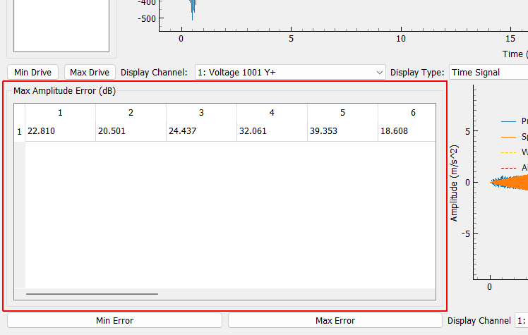
Max Amplitude Error (dB)
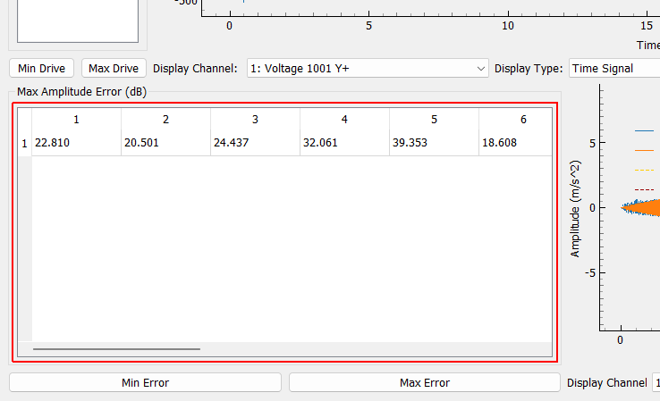
Maximum Amplitude Error Table A table showing the maximum amplitude error in decibels for each sine tone (rows) and control channel (columns). Cells highlighted yellow are predicted to hit warning limits while cells highlighted red are predicted to hit abort limits. Double-clicking on a cell will show the amplitude vs. frequency plot for that sine tone and control channel.
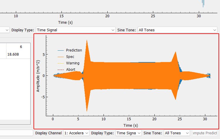
Response Prediction Plot Displays various quantities of interest related to the response predictions.
Min Error Visualize the signal with the smallest predicted amplitude error
Max Error Visualize the signal with the largest predicted amplitude error
Recompute Predictions Recompute predictions by running the control law again.
Response Prediction Display Channel Select the control channel to visualize
Response Prediction Display Type Selects the type of data to plot.
Response Prediction Sine Tone Selects the sine tone to plot.