Graphics
The chama.graphics module provides methods to help visualize results.
Signal graphics
Chama provides several functions to visualize signals described in the Simulation section (XYZ format only). Visualization is useful to verify that the signal was loaded/generated as expected, compare scenarios, and to better understand optimal sensor placement.
The convex hull of several scenarios can be generated as follows (Figure 3):
>>> chama.graphics.signal_convexhull(signal, scenarios=['S1', 'S2', 'S3'], threshold=0.01)
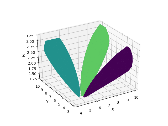
Figure 3 Convex hull plot
The cross section of a single scenarios can be generated as follows (Figure 4):
>>> chama.graphics.signal_xsection(signal, 'S1', threshold=0.01)
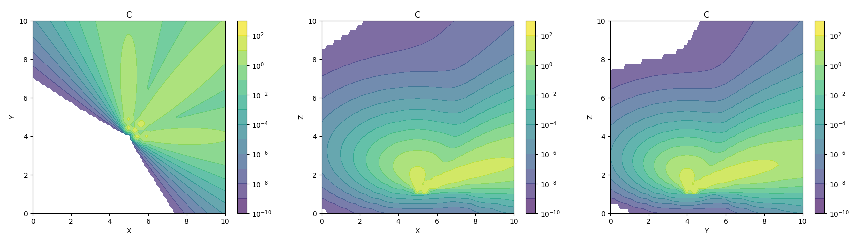
Figure 4 Cross section plot
Sensor graphics
The position of fixed and mobile sensors, described in the Sensor technology section, can be plotted. After grouping sensors in a dictionary, the locations can be plotted as follows (Figure 5):
>>> chama.graphics.sensor_locations(sensors)
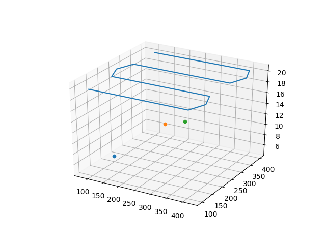
Figure 5 Mobile and stationary sensor locations plot
Tradeoff curves
After running a series of sensor placement optimizations with increasing sensor budget, a tradeoff curve can be generated using the objective value and fraction of detected scenarios. Figure 6 compares the expected time to detection and scenario coverage as the sensor budget increases.
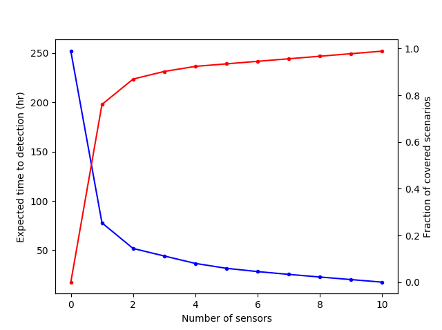
Figure 6 Optimization tradeoff curve
Scenario analysis
The impact of individual scenarios can also be analyzed for a single sensor placement using the optimization assessment. Figure 7 compares time to detection from several scenarios, given an optimal placement.
>>> print(results['Assessment'])
  Scenario Sensor  Impact
0       S1      A       4
1       S2      A       5
2       S3      B      10
3       S4      C       3
4       S5      A       1
>>> results['Assessment'].plot(kind='bar')
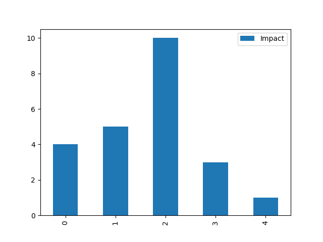
Figure 7 Scenario impact values based on optimal placement